Telling stories with data 01: exercising empathy with your figures
01: Exercising Empathy with Your Figures (you are here)02: Simple Design Principles03: Design ResourcesConsider this a mini primer on human-centered design for researchers.
The goal: give some basics & resources on communication and graphic design to improve your figures if you’re a scientist or researcher with very little or zero design training.
If you learn nothing else, design your figures with humanity in mind
A quick aside about me:
Designer turned researcher
Experience in graphic design, interior design, and communication
Training with emphasis on design for humans
Human-Centered Design Principles:

A design and management framework that develops solutions to problems by involving the human perspective in all steps of the problem-solving process.
Key: empathy and perspective taking for your audience
A human-centered design workflow includes:
First define ✨who✨ your audience is, empathize with them, and take their perspective
What does your audience already know about your data or science? What do they want to know?
Brainstorm what and how you want to communicate to them
Take a stab at designing your figure on paper as a rough draft
Take the perspective of your audience again - what is unclear about your figure? Reflect, refine, etc.
Read more here
2. Communication is key: Tell us a story.
Keep. It. Simple.
01. Start with paper.
02. Write who your audience is.
Are you making a figure to communicate to:
Beginners?
The “general” population?
Experts?
03. Write 1-2 sentences
These should be the "big idea" that you want to communicate

![The "big idea" - “top NBA team’s chances of winning the 2020 finals” [538 sports]](https://images.squarespace-cdn.com/content/v1/5ebd707c0c128360664ce1f1/1652879538603-GRR509XWQ3PHGL7J5YI0/top+NBA+teams+chances+of+winning+2020+finals.png)
04. Draw a rough idea of what you want your figure to look like on paper
Now that you have your audience and big idea written down, take a stab at designing a very rough draft of your figure. Paper is my personal preference for a quick sketch that is not precious and blocks out the main idea and will quickly show me the major pitfalls of my figure. Now is not the time to spend a ton of energy in your figure graphics software.
Remember: Everyone is tired.
Do not make us work hard to understand your figure.
Come back to your design and revise it so it is as simple to read and interpret as possible. This means: the text is large enough, it can be read in black and white, it communicates your “big idea” in a way your non-academic family or friends could get the gist of, and you are not cruel to your audience (e.g., please don’t make me turn my head 3 different ways to read the text on your figure). Pretend you are reading the figure in the most sleep-deprived and brain-foggy state possible and try to make your figure as lucid as possible in that state.
Note: Half a second is the time it takes for people to form their first impression of an infographic
Lane Harrison et al Infographic Aesthetics: Designing for the First Impression; Proc. ACM Human Factors in Computing Systems (CHI), 2015
Some examples of plots that take your audience work to understand

Minard’s display of Napoleon’s assault on Moscow, 1812
This may be an unpopular opinion, but there is a lot going on in this visualization and it takes time and some background knowledge to interpret it. It’s a very early graph and widely celebrated. And also… it’s a lot! We are tired and not experts on Napoleon’s assault in 1812. Your figure/visualization can (and should) do much much less.

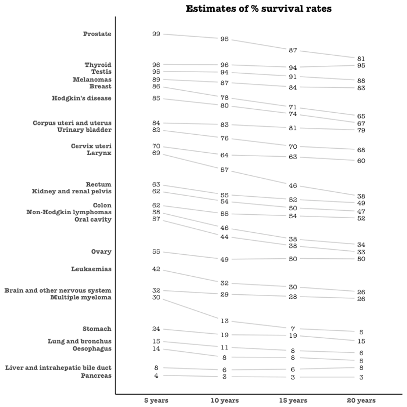
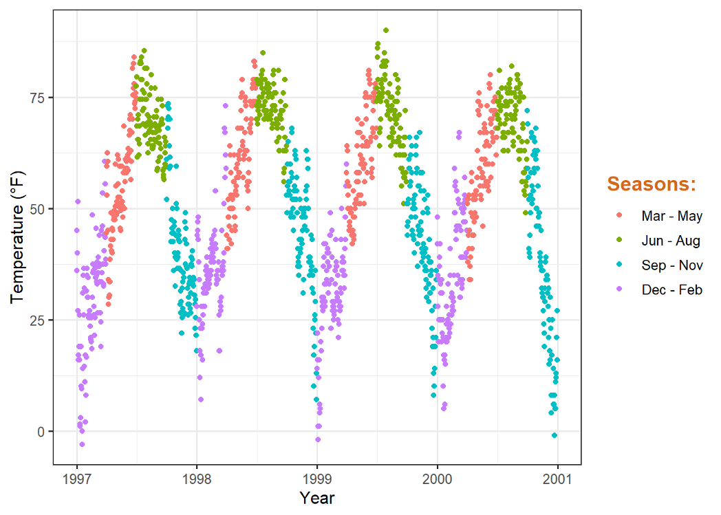
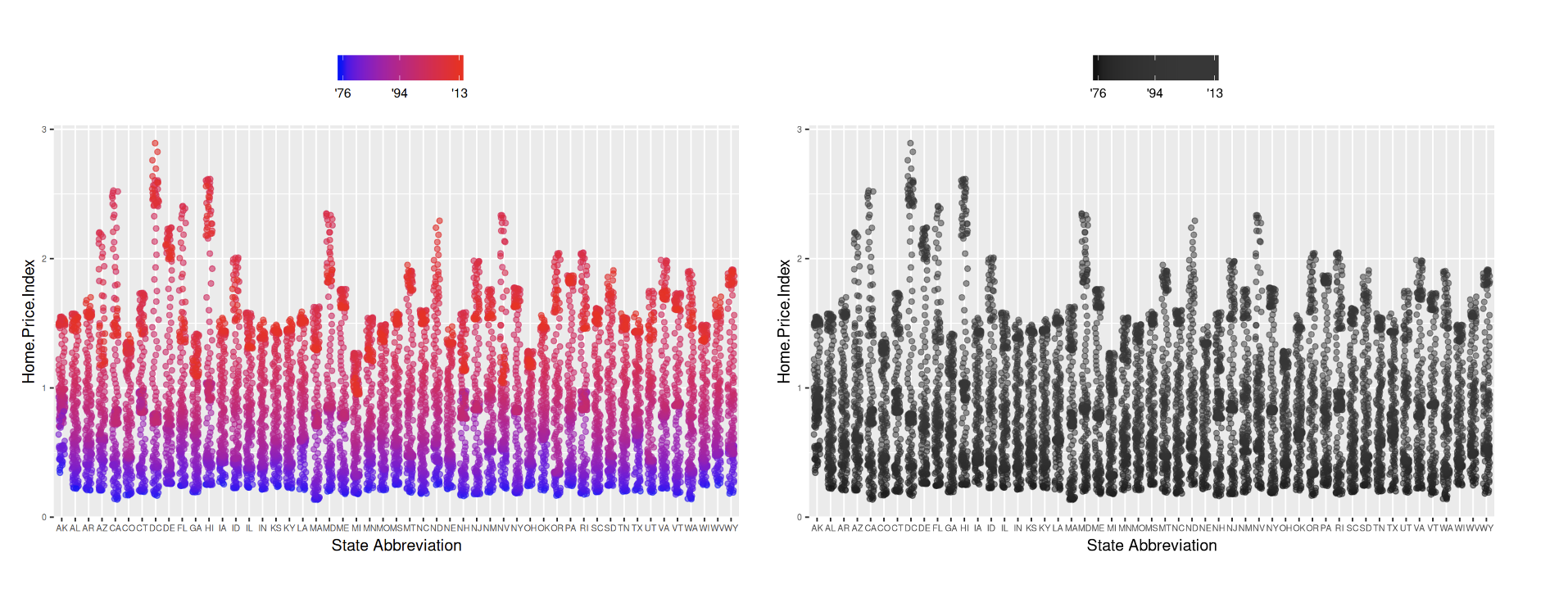
This has a do and a don’t baked in - don’t get cute with the scales. Align them so that your audience can read and compare between scales.

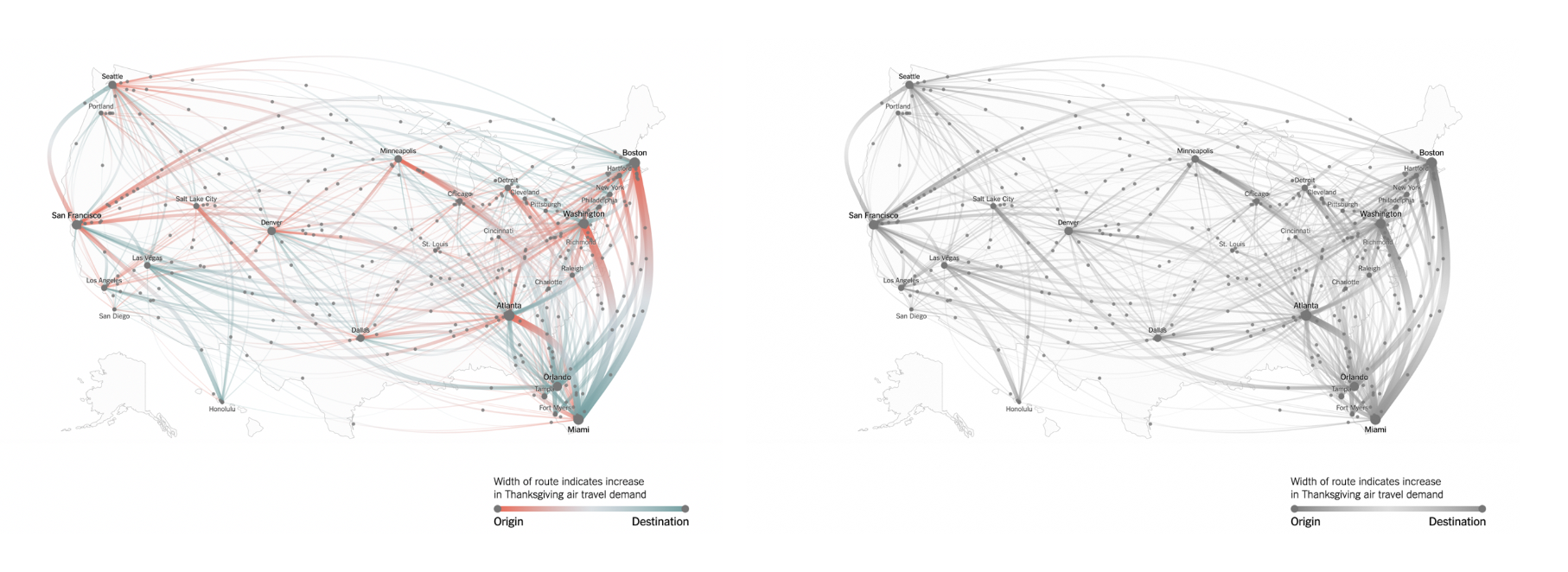
This is from the NYTimes and while it’s so pretty to look at, it is so difficult to read and interpret. I have to continue to refer to the legend to understand what the different colors and magnitudes mean. It’s pretty and nice to look at but I’m so tired. I don’t know what I’m supposed to take from this visualization!
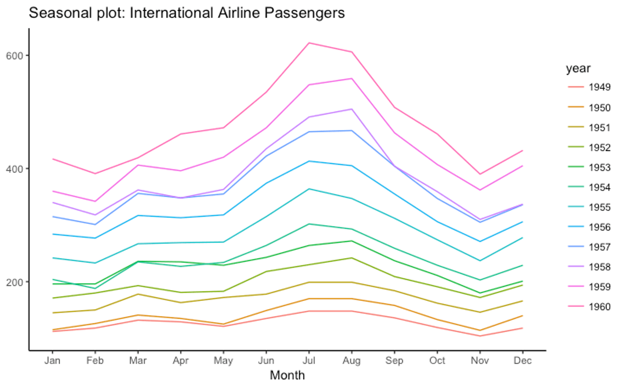
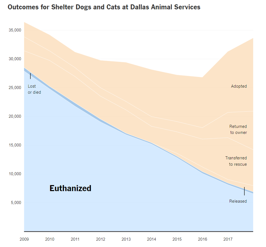
Some examples of plots that are kind to your audience
03. Empathy includes thinking & designing for accessibility
Work hard to not be ableist in how you design your figures.
This can encompass many things, including color blindness and vision correction.
At a minimum, please do your best to make your figures accessible to color-blind folks and don’t use text or line weights that are so small that anyone with reduced visual acuity has to squint or work hard to read it.
More information on designing for color blindness here.
Make your figure understandable in 1-3 seconds
(this conveniently works for both vision issues & semi-disinterested audiences)
Instead of relying just on hue (aka color differences), double-up with other visual variables and combine: [shape + hue] or [hue + lightness]
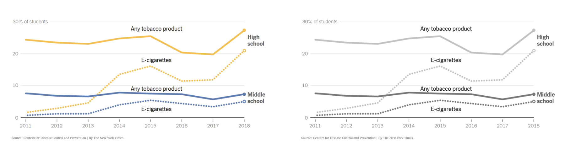
The test: is it still understandable in grayscale?

Click through for a design- and health-related podcast